



At times, the creations that we produce have genuine potential but may miss the mark (some by a smidgen - some by a lot). At the end of the day, "sellability" is the ultimate goal. We want to ensure that the product we put out will absolutely grab the attention of those passing by. And, this can mean that design work gets reworked and retooled.
Consider this example:
|
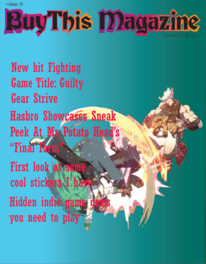
This cover has a primary element but it's teasers are pretty weak. They're difficult to read because they're strung together, with no separation between them. The color eventually gets camoflaged by the gradient and graphic, thus making it difficult to read. There are pretty sizeable pools of negative space that are desparately crying out for somethintg to occupy them. | 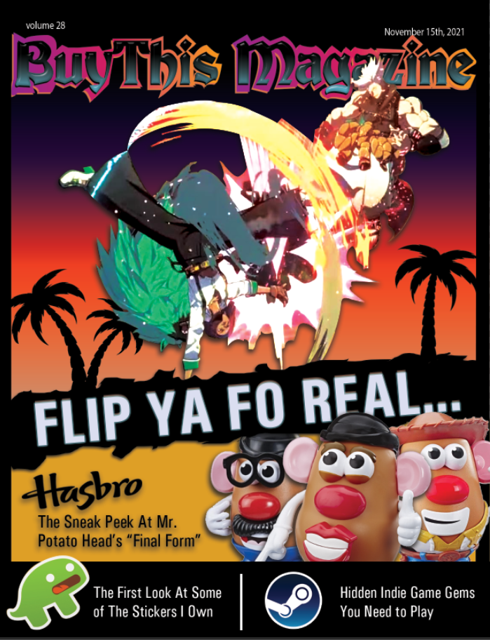 This cover uses the same primary element and masthead of the original but incorporates a lot more graphics (lizard sticker, steam logo, Potatoheads) emphasize the importance of the teasers and also utilizes the Hasbro logo as a visual disruption to just straight, boring text. There is a title to accompany the primary target that says 'Flip Ya Fo Real," so that the graphic isn't simply just "...sort of there." |
Select a cover that another student designed and redesign that cover in your own way. What can be improved (according to comments left in the comment section of the Google Slides)?
These new versions will be critiqued just like the original versions were.
| Criteria | No | Yes |
| Three thumbnail sketches must be provided | 0 | 2 |
| One "comp" of the accepted logo must be illustrated | 0 | 2 |
| Layers (Photoshop/Illustrator) must be properly labeled and organized | 0 | 2 |
| An original "Masthead" (logo) must be created in Illustator prior to importing it into Photoshop | 0 | 2 |
| Flawless "Knock outs" (areas around objects that will be deleted - the Pen Tool/Select) are required for overlapping shapes. | 0 | 2 |
| Use proper and consistent color themes for the cover design. | 0 | 2 |
| Combine photorealistic images with illustrations, shapes, and other elements. | 0 | 2 |
| The cover must include three "teasers," text that gives a sneak preview of the magazine's contents. Make sure all spelling is correct. | 0 | 2 |
| Cover must be school appropriate. Keep it clean and keep things cool. | 0 | 2 |
| Magazine cover should include a "Primary Element," to grab an observer's attention | 0 | 2 |
| Magazine cover should use a good format for gutters/margins (spaces between text and the cover's edge. Or, the spacing between text and the edge of boarders, text boxes, etc). | 0 | 2 |
| Subjective Analysis | 0 | 14 |
| Total Points Available: | 36 |
