



Due Date: November 16
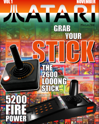



There are many, many factors to consider when designing for someone else – such as opinion only goes so far. Magazine covers are an everyday medium that people, all across the globe, are exposed to at just about everywhere they go. From gas stations to doctor’s offices, shelves, tables, and even chairs are resting places for a magazine that is focused towards a particular lifestyle, interest, political view, age group, gender, and every sub-group imaginable. And, because of this, magazine cover art is designed to try and stand apart from the “rest.” Learning the tools of the trade, and the techniques in using such tools, enables the design a license of creative power that is not available to most – the power to influence another’s eyes to wander over to their body of work.
Enduring Understandings:
Upon completion of this lesson, the students will understand and be able to execute the layout of a magazine cover by using a masthead, teasers, cover art, elemental flow, balance, color, shapes, primary elements, and industry standard tools and software to manufacture a cover piece.Activity: “Make the Magazine Cover”
Your task is to create a magazine cover that focuses towards an interest of some type – that interest could be yours or someone else’. For instance, imagine that you have been contracted to create a magazine cover for The Saturday Evening Post. You may have never even heard of this magazine before. But, money is money. And, they’re rumored to pay out big bucks. It might do some good to research previous covers that the magazine has brandished over the years – just to get an idea of what they might be looking for. And, it might also be a good idea to figure out what their top stories are this month, so as to include “teasers” about each story on the magazine cover.
- A custom (original) Mast Head must be produced. The Mast Head must include:
- Volume Number
- Date
- Title of Magazine (The Mast Head Title) must be sketched out first before you start building in Illustrator
- Three (or more) Teasers (highlighting other stories contained in the magazine
- Knock-Outs (using the pen tool). I do not want a simple cut/paste of an image in the background. Our Magazine cover will be collage style, with overlapping shapes and images.
- The magazine cover will have a Prmary Element that is easily identifiable (the star of the show - the main attraction).
- The magazine cover will use the proper use of "gutters" and "margins."
- The magazine cover must be "school appropriate."
| Criteria | No | Yes |
| Three thumbnail sketches must be provided | 0 | 2 |
| One "comp" of the accepted logo must be illustrated | 0 | 2 |
| Layers (Photoshop/Illustrator) must be properly labeled and organized | 0 | 2 |
| An original "Masthead" (logo) must be created in Illustator prior to importing it into Photoshop | 0 | 2 |
| Flawless "Knock outs" (areas around objects that will be deleted - the Pen Tool/Select) are required for overlapping shapes. | 0 | 2 |
| Use proper and consistent color themes for the cover design. | 0 | 2 |
| Combine photorealistic images with illustrations, shapes, and other elements. | 0 | 2 |
| The cover must include three "teasers," text that gives a sneak preview of the magazine's contents. Make sure all spelling is correct. | 0 | 2 |
| Cover must be school appropriate. Keep it clean and keep things cool. | 0 | 2 |
| Magazine cover should include a "Primary Element," to grab an observer's attention | 0 | 2 |
| Magazine cover should use a good format for gutters/margins (spaces between text and the cover's edge. Or, the spacing between text and the edge of boarders, text boxes, etc). | 0 | 2 |
| Subjective Analysis | 0 | 14 |
| Total Points Available: | 36 |
| Criteria | No | Yes |
| Three thumbnail sketches must be provided | 0 | 2 |
| One "comp" of the accepted logo must be illustrated | 0 | 2 |
| Layers (Photoshop/Illustrator) must be properly labeled and organized | 0 | 2 |
| An original "Masthead" (logo) must be created in Illustator prior to importing it into Photoshop | 0 | 2 |
| Flawless "Knock outs" (areas around objects that will be deleted - the Pen Tool/Select) are required for overlapping shapes. | 0 | 2 |
| Use proper and consistent color themes for the cover design. | 0 | 2 |
| Combine photorealistic images with illustrations, shapes, and other elements. | 0 | 2 |
| The cover must include three "teasers," text that gives a sneak preview of the magazine's contents. Make sure all spelling is correct. | 0 | 2 |
| Cover must be school appropriate. Keep it clean and keep things cool. | 0 | 2 |
| Magazine cover should include a "Primary Element," to grab an observer's attention | 0 | 2 |
| Magazine cover should use a good format for gutters/margins (spaces between text and the cover's edge. Or, the spacing between text and the edge of boarders, text boxes, etc). | 0 | 2 |
| Subjective Analysis | 0 | 14 |
| Total Points Available: | 36 |
